
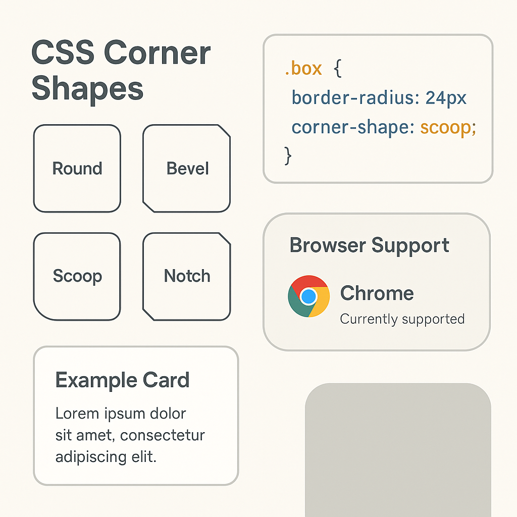
Mastering CSS corner-shape: A Guide to Usage, Values, and Examples
Did you know that an astonishing 90% of users form an opinion about a website based solely on its visual design? This means those little details, like perfectly sculpted corners, can make or break a user's first impression. For too long, web designers have been limited to the standard, sharp-edged rectangles or slightly rounded corners achieved through border-radius. But what if you could create truly unique, eye-catching shapes for your website's elements? Enter the revolutionary CSS corner-shape property. This powerful tool, though relatively new, is poised to transform how we think about UI design, allowing for unprecedented creative freedom.
Key Takeaways
corner-shapeallows custom styling of element corners beyond simple rounding.- Key values include
auto,round,bevel, andhidden. - It works in conjunction with
border-radius, which defines the size and base shape. roundcreates perfect circular arcs;bevelcreates sharp, diagonal edges.- Browser support is good in modern browsers but requires checking and fallbacks for older ones.
- Use
overflow: hiddento contain content within shaped corners. - Avoid overuse and ensure accessibility remains a priority.
- Consider
corner-shapeas part of a broader CSS styling toolkit, includingborder-imageandclip-path.
What is CSS corner-shape?
The corner-shape property in CSS is a game-changer for web design, enabling developers to define custom shapes for the corners of HTML elements. Instead of being confined to the traditional rounded or sharp angles, corner-shape allows for a vast array of possibilities, from elegant curves to dramatic beveled edges and even more abstract forms. This property works hand-in-hand with border-radius and other related CSS properties to provide granular control over the visual aesthetics of any element. It’s like giving your design a whole new set of sculpting tools, moving beyond the basic chisel to include intricate carving instruments. This allows for a level of visual flair that was previously only achievable with complex SVG graphics or image manipulation.
Who should use CSS corner-shape?
This guide is tailor-made for front-end developers, web designers, and UI/UX enthusiasts who are eager to push the boundaries of visual design on the web. If you're someone who loves to experiment with new CSS features and wants to create interfaces that truly stand out, you'll find corner-shape an invaluable addition to your toolkit. Are you a developer looking to impress clients with unique, modern designs? Do you find yourself wishing for more control over the exact curve and form of your element's edges? Then this is for you. It’s also perfect for those working on branding projects where distinctive visual elements are crucial for establishing a strong identity. If you're building a portfolio site, a SaaS product, or even an e-commerce platform like the Phantom Bookstore, understanding corner-shape can elevate your aesthetic.
When is CSS corner-shape not recommended?
Conversely, this guide might not be your primary focus if you're primarily a back-end developer with little interest in visual presentation, or if your projects exclusively demand simple, no-frills, utilitarian interfaces. If you're content with the standard border-radius implementations and have no immediate need for highly stylized corners, you might find the details here a bit niche. This isn't for someone who believes that function trumps all form to the point of aesthetic austerity. Also, if you're working with very old browsers that lack support for modern CSS features, diving deep into corner-shape might be premature. However, even then, understanding its potential can help you plan for future updates and design iterations.
Understanding the Core Concepts: corner-shape and border-radius
Before we dive headfirst into corner-shape, it's essential to have a firm grasp on its close companion: border-radius. You've likely used border-radius extensively to create rounded corners. It’s the bread-and-butter for softening edges. border-radius allows you to specify a radius value for each corner, effectively creating quarter-ellipses. You can use a single value for all corners, or individual values for top-left, top-right, bottom-right, and bottom-left.
Now, imagine border-radius as drawing a perfect arc. corner-shape, on the other hand, gives you the power to define the type of curve or angle that arc follows. It dictates the profile of the corner. While border-radius controls the size of the rounding, corner-shape controls the form of the transition. Think of it like this: border-radius sets the distance from the corner point inward, and corner-shape sculpts the path that the edge takes within that distance. This is a fundamental shift, moving from simply rounding to actively shaping.
Key Values of corner-shape
The corner-shape property accepts a few distinct values, each offering a unique way to modify your element's corners. Let's break them down:
auto
This is the default value. When corner-shape is set to auto, the browser interprets the corner shape based on the border-radius property. If border-radius is set to a non-zero value, auto typically results in a standard elliptical curve. If border-radius is zero or not set, the corner remains sharp. It's the safe, predictable option that ensures compatibility.
round
The round value is where things start getting interesting. When you apply corner-shape: round; along with a border-radius value, it instructs the browser to create a perfectly circular arc for that corner. This is different from the default elliptical curve border-radius might produce on its own, especially when different horizontal and vertical radii are specified. Using round ensures a consistent, smooth circular segment, which can be particularly pleasing for buttons or cards. It's like asking for a perfectly smooth, unbroken loop in your corner's contour.
bevel
This value creates a beveled edge. Imagine slicing off the corner at a specific angle. corner-shape: bevel; achieves this, resulting in a sharp, clean diagonal line across the corner. This gives a more geometric, sometimes more sophisticated look compared to a simple curve. It's excellent for adding a touch of subtle detail without being overly ornate. Think of it as a precise cut, offering a defined edge rather than a soft fade. This can be a subtle yet powerful way to differentiate your design elements.
hidden
This is a more specialized value. corner-shape: hidden; effectively hides the corner, making it transparent or invisible. This is particularly useful when you want to overlay elements or create complex layered effects where the corner of one element shouldn't interfere visually with another. It’s like drawing a boundary and then erasing the corner within that boundary, allowing whatever is behind to show through cleanly.
Practical Applications and Examples
Let's move from theory to practice. How can you actually use corner-shape to enhance your designs?
Creating Unique Button Styles
Buttons are prime candidates for corner-shape experimentation. Standard rounded buttons are common, but what about buttons with beveled edges for a more tactile feel?
.button-beveled {
  background-color: #4CAF50;
  color: white;
  padding: 15px 30px;
  border: none;
  border-radius: 10px; /* Sets the overall size of the corner modification */
  corner-shape: bevel; /* Applies the beveled edge */
  font-size: 16px;
  cursor: pointer;
  transition: background-color 0.3s ease;
}

.button-beveled:hover {
  background-color: #45a049;
}
In this example, the .button-beveled class creates a button with a distinct beveled corner. The border-radius: 10px; defines the extent of the corner modification, and corner-shape: bevel; dictates that this modification should be a sharp, diagonal cut. This offers a more refined and less "soft" appearance than a standard rounded button.
Designing Distinctive Cards
Cards are ubiquitous in modern web design. corner-shape can help your cards break the mold.
.card-circular-corner {
  width: 300px;
  border: 1px solid #ddd;
  border-radius: 20px; /* Sets the base radius */
  corner-shape: round; /* Ensures a perfect circular arc */
  overflow: hidden; /* Important to clip content within the shaped corner */
  box-shadow: 0 4px 8px rgba(0,0,0,0.1);
  padding: 20px;
  background-color: white;
  margin: 20px;
}
Here, .card-circular-corner uses corner-shape: round; to ensure that the corners are perfect circular segments, not just ellipses. The border-radius: 20px; defines how large these circular segments are. overflow: hidden; is crucial to ensure any content within the card doesn't spill out past the newly shaped corners. This gives the card a softer, more contained look.
Advanced Usage with border-radius Shorthands
The real power emerges when you combine corner-shape with the advanced shorthands of border-radius. Remember, border-radius can accept up to eight values to control individual corners and even elliptical curves.
For instance, to apply a beveled shape only to the top-left and bottom-right corners, while keeping the others rounded:
.element-mixed-corners {
  width: 200px;
  height: 100px;
  background-color: lightblue;
  border: 1px solid blue;
  border-radius: 50px 10px 50px 10px / 10px 50px 10px 50px; /* Complex elliptical radii */
  corner-shape: bevel 50px 10px 50px 10px; /* Apply bevel to specific corners */
}
In this more complex scenario, border-radius is defined with two sets of four values, creating elliptical corners. The corner-shape: bevel 50px 10px 50px 10px; then applies the beveled effect, mirroring the border-radius values to define the extent and shape of the bevel for each corresponding corner. This level of control is immense. You can create incredibly intricate and unique shapes that are impossible with border-radius alone. This allows for design elements that feel truly custom-built.
Browser Support and Considerations
As a relatively new CSS feature, browser support for corner-shape is still evolving. As of 2026, major modern browsers like Chrome, Firefox, Safari, and Edge offer good support. However, you should always check the latest compatibility tables (e.g., on MDN Web Docs) before implementing corner-shape in production environments, especially if you need to support older browsers.
When corner-shape is not supported, the browser will typically fall back to the default auto behavior, meaning the corners will render based solely on border-radius. This graceful degradation ensures your site remains usable, albeit without the custom corner styling. For critical design elements, consider providing fallback styles or using JavaScript-based solutions for older browser support if absolutely necessary. It’s always wise to test your designs across different browsers and devices.
W3C Standards Status
It is important to note that the corner-shape specification is managed by the W3C CSS Working Group as part of the Working Draft specifications (specifically within the CSS Borders and Box Decorations Module Level 4). While experimental implementation is undergoing active adoption across major rendering engines, the specification remains an ongoing W3C Working Draft. Syntax requirements, keyword definitions, and edge-case behaviors are subject to updates or refinement prior to reaching full Candidate Recommendation status.
Performance Implications
Generally, using CSS properties like corner-shape has minimal performance impact. They are rendered natively by the browser's engine. Unlike complex SVG manipulations or heavy JavaScript-driven visuals, CSS properties are typically optimized for speed. The primary concern for performance usually lies with large images, inefficient JavaScript, or excessive DOM manipulation. corner-shape is a lightweight styling property. However, if you were to create an extremely high number of elements with highly complex corner-shape and border-radius combinations, you might observe a marginal difference, but this is unlikely to be a bottleneck in most real-world applications. Focusing on efficient code structure and optimized assets remains the most impactful way to ensure good performance. If you're looking to speed up your website, exploring techniques like those in Powerful Shopify Store My Top Five Speed Hacks can offer more significant gains.
Styling Beyond Corners: Related CSS Properties
While corner-shape is fantastic, it's part of a larger ecosystem of CSS properties that allow for detailed styling. Understanding these can help you create cohesive and polished designs.
border-radius: As discussed, this is fundamental. It defines the size and elliptical shape of the corner segment.border-image: This property allows you to use an image to draw the borders of an element. You can combine it withcorner-shapefor truly unique visual effects where the border itself has a custom form.clip-path: Whilecorner-shapespecifically targets corners,clip-pathallows you to clip an element to any shape (circle, ellipse, polygon, or even SVG paths). It's a more powerful, albeit more complex, tool for defining visible areas of an element. You could potentially achieve somecorner-shapeeffects usingclip-path, butcorner-shapeoffers a more direct and semantic way to style just the corners.box-shadow: Essential for adding depth and dimension. A well-placedbox-shadowcan enhance the perceived 3D effect of beveled or uniquely shaped corners.outline: Similar toborder, but it doesn't take up space in the layout. You can style outlines independently, and they will follow thecorner-shapeof the element.
By understanding how these properties interact, you can create sophisticated and visually rich user interfaces. For instance, leveraging border-radius and corner-shape effectively can contribute significantly to How to Elevate Small Business Branding with User Experience.
Mistakes to Avoid
Even with powerful tools, pitfalls exist. Here are common mistakes to steer clear of when using corner-shape:
- Ignoring Browser Support: Implementing
corner-shapewithout checking compatibility can lead to broken designs in older browsers. Always have fallbacks. - Overuse: Just because you can create wild shapes doesn't mean you should for every element. Too much visual complexity can overwhelm users and detract from usability. Subtle, intentional use is often more effective.
- Forgetting
overflow: hidden: When shaping corners significantly, especially withroundor complexborder-radiusvalues, content might bleed outside the element's bounds.overflow: hidden;is your best friend here. - Neglecting Accessibility: Ensure your custom corner shapes don't hinder readability or usability. High contrast ratios and clear visual hierarchy are paramount. Unusual shapes shouldn't obscure important information.
- Not Understanding
border-radiusInteraction:corner-shapeworks withborder-radius. Ifborder-radiusisn't set appropriately,corner-shapemight not have the desired effect or might behave unexpectedly. Understand how their values influence each other. - Confusing with
clip-path: While related, they serve different purposes.corner-shapeis specific to corners, offering a simpler syntax for that task.clip-pathis for arbitrary shapes across the entire element.
Actionable Checklist for Implementing corner-shape
Ready to start using corner-shape? Follow this checklist:
- Identify Target Elements: Determine which elements (buttons, cards, input fields, etc.) would benefit most from custom corner styling.
- Define Desired Shape: Decide whether you need
round,bevel,hidden, orauto(default). - Set
border-radius: Specify theborder-radiusvalue(s) to control the size and extent of the corner modification. - Apply
corner-shape: Add thecorner-shapeproperty with its chosen value. - Consider Shorthands: For complex designs, utilize the advanced
border-radiusandcorner-shapeshorthands for individual corner control. - Add
overflow: hidden: If necessary, applyoverflow: hidden;to ensure content stays within the shaped boundaries. - Test Browser Compatibility: Use tools like Can I Use to verify support for your target browsers.
- Implement Fallbacks: Provide alternative styling (e.g., standard
border-radius) for browsers that don't supportcorner-shape. - Check Accessibility: Ensure the design is usable and readable for all users.
- Review Performance: Monitor any potential performance impacts, though typically minimal.
- Iterate and Refine: Adjust values and experiment until the desired aesthetic is achieved.
Get the CSS3 Cheatsheet for a comprehensive reference to all the properties and techniques you can use alongside corner-shape to create stunning web designs.
Conclusion
The CSS corner-shape property is a powerful, albeit currently niche, feature that unlocks a new dimension of creative control for web designers and developers. By moving beyond simple rounding, we can now sculpt the very edges of our interfaces, creating more distinctive, engaging, and memorable user experiences. Whether you're aiming for the subtle elegance of a beveled edge or the smooth perfection of a circular arc, corner-shape provides the tools. While browser support continues to mature, embracing this property now positions you at the forefront of modern web design trends. Don't be afraid to experiment; the future of web aesthetics is being shaped, one corner at a time. Consider how incorporating these advanced CSS techniques could complement your overall web development strategy, perhaps even leading to innovative solutions like converting your website into an app using the methods outlined in 10 Powerful Ways to Convert Your WordPress Website into an App (Step-by-Step Guide).
Frequently Asked Questions
What is the primary difference between border-radius and corner-shape?
The fundamental distinction lies in their function. border-radius dictates the size and elliptical form of the corner curve. Think of it as defining the boundary within which the corner modification occurs. corner-shape, conversely, defines the type of curve or edge within that boundary. It specifies the profile—whether it's a standard curve (auto), a perfect circle (round), a sharp diagonal cut (bevel), or invisible (hidden). You need both properties working together to achieve custom corner aesthetics.
Can I apply different corner-shape values to different corners of an element?
Yes, you absolutely can! Similar to how border-radius supports individual values for each corner (e.g., border-radius: 10px 20px 30px 40px;), corner-shape can also accept multiple values corresponding to the corners. You would list the values in the same order: top-left, top-right, bottom-right, bottom-left. For example: corner-shape: round bevel auto hidden;. This allows for highly intricate and asymmetrical designs.
How does corner-shape: bevel actually work?
When you set corner-shape: bevel;, you're instructing the browser to create a straight, diagonal line segment that cuts across the corner. The border-radius property still defines the overall extent of this corner modification. So, if you have border-radius: 20px; and corner-shape: bevel;, the bevel will effectively span the space defined by that 20px radius, creating a clean, sharp chamfered edge rather than a curve. The exact angle of the bevel is determined by the interplay between the border-radius values for horizontal and vertical radii.
Is corner-shape a replacement for border-radius?
No, corner-shape is not a replacement for border-radius; it's a complementary property. border-radius is still essential for defining the dimensions and basic shape of the corner modification. corner-shape modifies how that defined space is rendered. You cannot achieve custom corner shapes using corner-shape alone; it requires a border-radius value greater than zero to have any effect. They are designed to be used together.
What are the performance implications of using corner-shape extensively?
In most scenarios, the performance impact of using corner-shape is negligible. CSS properties like this are handled efficiently by browser rendering engines. They are far less performance-intensive than complex JavaScript animations or large image assets. Unless you are applying extremely complex, custom corner-shape and border-radius combinations to thousands of elements simultaneously on a page, performance issues are highly unlikely to arise directly from this property. Focus on optimizing other areas of your site for better performance gains.
Can corner-shape: hidden be used for creating transparent cutouts?
Absolutely! corner-shape: hidden; is precisely for that purpose. When applied, it makes the corner area effectively transparent, allowing any background or underlying elements to show through. This is incredibly useful for creating layered effects, intricate layouts, or masking parts of an element without resorting to more complex techniques like clip-path (which affects the entire element, not just corners). It’s a clean way to achieve specific visual compositions by making corners disappear.
Looking for implementation support? Visit our web development services page for the full service overview.
About the Author

Brian Keary
Founder & Lead Developer
Brian is the founder of BKThemes with over 20 years of experience in web development. He specializes in WordPress, Shopify, and SEO optimization. A proud alumnus of the University of Wisconsin-Green Bay, Brian has been creating exceptional digital solutions since 2003.
Expertise
Writing since 2003