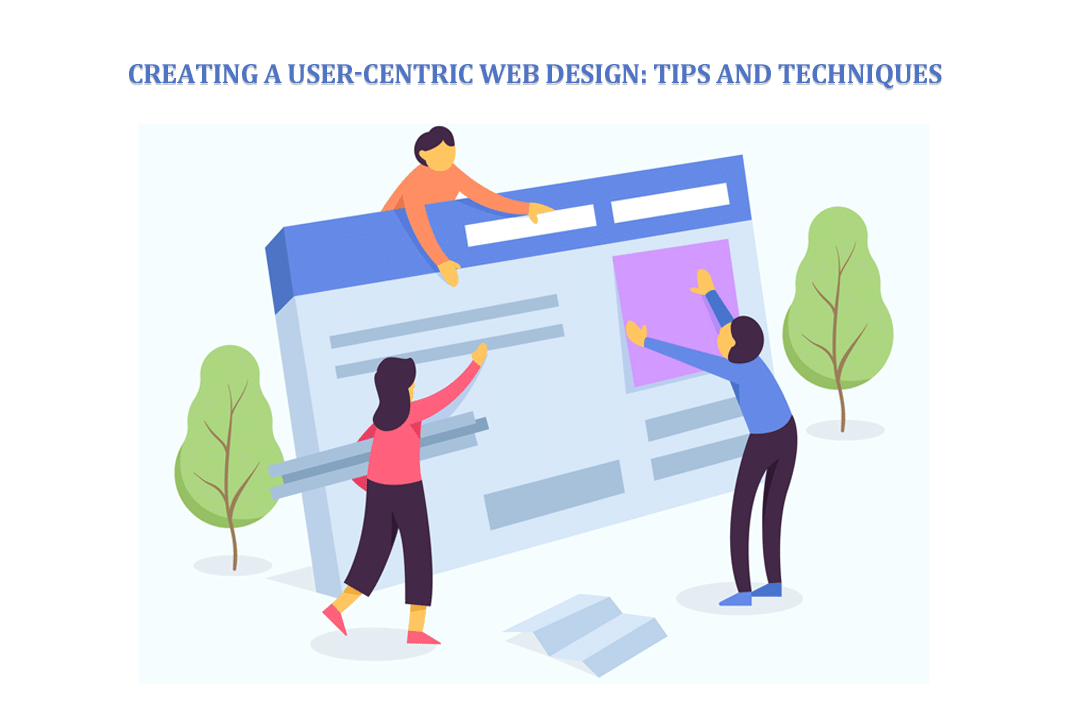
Did you know that 88% of online consumers are less likely to return to a site after a bad user experience? Forbes That's a staggering number, isn't it? It means that if your website feels clunky, confusing, or just plain annoying, you're essentially showing folks the door before they even get a chance to browse. In today's digital landscape, a website isn't just a digital brochure; it's a bustling marketplace, a helpful resource, or a vibrant community hub. Making sure it's a pleasant place to be is paramount. User-centric web design is all about putting the visitor at the heart of every decision you make. It’s about understanding their needs, anticipating their desires, and building an experience that feels intuitive and genuinely helpful. Let's dive into how we can make your website not just functional, but truly delightful.
Who This is For
This guide is for anyone involved in creating or managing a website. Whether you're a small business owner looking to boost online sales, a blogger aiming to grow your readership, a designer sketching out new interfaces, or a developer bringing visions to life, this information will be invaluable. If you're tired of seeing high bounce rates and low conversion numbers, and you're ready to build a digital presence that truly connects with its audience, then you're in the right place. This is for the curious, the ambitious, and anyone who believes that a website should serve its users first and foremost.
Who This is NOT For
This article isn't for those who believe that flashy animations and overwhelming amounts of information are the keys to online success. If your primary focus is on cramming as many ads as possible onto a page or if you're uninterested in understanding your audience's journey, then this guide might not resonate with you. It's also not for individuals who are resistant to feedback or unwilling to iterate on their designs based on user behavior. We're focusing on building meaningful connections, not just fleeting traffic.
Build something better
Need a developer who can actually ship the fix, feature, or rebuild?
This post is in Web Development, so here’s the most relevant next step if you want help applying it.
We handle custom web development, performance improvements, design upgrades, and ongoing technical support for sites that need more than templates.
- Custom development for WordPress, Shopify, and modern web stacks
- Performance, UX, and conversion-focused improvements
- Hands-on implementation with no pass-the-buck nonsense
The Core Philosophy: Understanding Your Audience
At its heart, user-centric design is empathy in action. It’s about stepping into your visitor's shoes and seeing your website through their eyes. This isn't just a feel-good concept; it's a strategic imperative. When you prioritize your users, you build trust, foster loyalty, and ultimately achieve your website's goals more effectively. Think of it like hosting a party. You wouldn't just throw open your doors and expect guests to fend for themselves. You'd make sure there's enough food, clear directions to the restroom, comfortable seating, and perhaps some background music. Your website should offer a similarly welcoming and well-managed experience.
Gathering User Insights
Before you can design for your users, you need to know your users. This means moving beyond assumptions and diving into real data. User personas are fictional, generalized representations of your ideal customers. They help you visualize your audience, understand their motivations, pain points, and goals. Think about creating a persona for "Busy Brenda," a working mom who needs to find information quickly on her commute, or "Tech-Savvy Tom," a student researching complex topics who values in-depth content and easy navigation.
Beyond personas, conduct user interviews, surveys, and analyze website analytics. Tools like Google Analytics can tell you what users are doing (e.g., which pages they visit, how long they stay), while qualitative methods can tell you why. Observing users interact with your site, even through session recording tools, can reveal hidden frustrations or areas of confusion. This deep understanding is the bedrock of effective user-centric design.
Mapping the User Journey
Once you understand who your users are, the next step is to map out their journey. What are they trying to accomplish when they arrive at your site? Are they looking for a specific product, seeking information, or trying to contact you? Visualizing this path helps you identify potential roadblocks and opportunities to improve their experience.
Consider the "hero's journey" concept, but applied to your website. What is the user's initial quest? What challenges do they face? How does your website guide them towards their goal (their "victory")? This journey mapping is crucial for ensuring that every element of your site supports the user's objectives.
Essential Elements of User-Centric Design
So, how do we translate user insights into an actual website? It boils down to several key principles that work in harmony.
Intuitive Navigation and Information Architecture
A website's structure is like its nervous system. If it's tangled or broken, nothing works properly. Your navigation should be clear, consistent, and predictable. Users should be able to find what they're looking for within a few clicks, without having to guess where to go. This involves thoughtful information architecture – the organization, structure, and labeling of content.
- Logical Grouping: Group related content together. If you sell clothing, have clear categories like "Men's," "Women's," "Accessories," etc.
- Clear Labeling: Use straightforward language for your menu items. Avoid jargon or internal company terms that users won't understand.
- Consistent Placement: Keep your main navigation in the same place on every page. Most users expect it at the top or along the left side.
- Search Functionality: A robust search bar is a lifesaver, especially for larger sites. Make sure it's easy to find and delivers relevant results.
Implementing these principles is a core part of Creating a User-Centric Web Design: Tips and Techniques.
Accessibility for All
User-centric design inherently means designing for everyone. Accessibility ensures that people with disabilities can perceive, understand, navigate, and interact with your website. This isn't just a matter of compliance; it's about inclusivity and reaching the broadest possible audience.
Key accessibility considerations include:
- Alt Text for Images: Provide descriptive text for images so screen readers can convey their meaning to visually impaired users.
- Keyboard Navigation: Ensure your entire site can be navigated using only a keyboard.
- Sufficient Color Contrast: Text should be easily readable against its background.
- Clear Form Labels: Associate labels with form fields so assistive technologies can identify them.
- Captions for Videos: Provide text alternatives for audio and video content.
Building an accessible website is a hallmark of thoughtful design and broadens your reach significantly.
Performance and Speed: The Unsung Heroes
In our fast-paced world, patience is a rare commodity. A slow-loading website is a major deterrent. Users expect pages to load almost instantly. Studies consistently show that even a one-second delay can lead to a significant drop in conversions and user satisfaction.
Optimizing your website's performance involves:
- Image Optimization: Compress images without sacrificing quality.
- Minifying Code: Reduce the size of CSS, JavaScript, and HTML files.
- Leveraging Browser Caching: Store website data locally on a user's device for faster subsequent visits.
- Choosing a Reliable Hosting Provider: Your host significantly impacts your site's speed and uptime.
Focusing on these aspects is crucial for keeping users engaged. Check out 7 Essential Tips for Improving Website Performance and Speed for more detailed strategies.
Clear Calls to Action (CTAs)
What do you want your users to do next? Whether it's "Buy Now," "Learn More," "Sign Up," or "Contact Us," your calls to action need to be prominent and unambiguous. A user-centric design guides visitors naturally towards these desired actions.
- Visibility: CTAs should stand out visually through color, size, and placement.
- Action-Oriented Language: Use verbs that clearly state the intended action.
- Contextual Relevance: Place CTAs where they make sense within the user's journey.
A strong CTA acts like a friendly signpost, pointing users in the right direction.
Mobile Responsiveness: A Non-Negotiable
With the majority of internet traffic now coming from mobile devices, a responsive design is not optional; it's essential. Your website must adapt seamlessly to different screen sizes, from large desktop monitors to small smartphone displays. This means ensuring that text is readable, buttons are tappable, and navigation remains functional on any device. A poor mobile experience will alienate a huge portion of your potential audience.
Design Techniques for a Better User Experience
Beyond the core principles, specific design techniques can elevate your website's user-friendliness.
Visual Hierarchy and Layout
The way elements are arranged on a page guides the user's eye. A strong visual hierarchy ensures that the most important information or actions are the most prominent. This can be achieved through:
- Size: Larger elements naturally draw more attention.
- Color: Contrasting colors can highlight key areas.
- Placement: Items at the top or center of the page often receive more focus.
- White Space: Ample negative space prevents clutter and makes content easier to digest.
A well-structured layout feels organized and less overwhelming.
Readability and Typography
The fonts you choose and how you use them have a significant impact on readability.
- Font Choice: Select legible fonts that are easy to read on screens. Sans-serif fonts are often preferred for body text online.
- Font Size: Ensure body text is large enough to be comfortable for most users.
- Line Height and Spacing: Adequate spacing between lines and paragraphs improves comprehension.
- Contrast: Maintain good contrast between text and background.
Readability is a fundamental aspect of user experience.
Feedback and Interaction
Users appreciate knowing that their actions have been registered. Providing clear feedback makes the interaction feel more responsive and less like talking into a void.
- Button States: Buttons should change appearance when hovered over or clicked.
- Form Validation: Provide immediate feedback on form errors.
- Loading Indicators: Show users when content is loading.
- Confirmation Messages: Clearly indicate when a task has been successfully completed.
These subtle cues build confidence and reduce user frustration.
Consistency is Key
Maintain a consistent design language throughout your website. This includes consistent use of colors, typography, button styles, and layout patterns. Consistency reduces the cognitive load on users, as they don't have to re-learn how things work on different pages. This contributes significantly to 5 tips for creating a pleasing website design.
Mistakes to Avoid
Even with the best intentions, it's easy to stumble. Here are common pitfalls to steer clear of:
- Ignoring User Feedback: Don't fall in love with your own ideas so much that you dismiss what your users are telling you.
- Over-Complication: Resist the urge to add every trendy feature. Simplicity often wins.
- Prioritizing Aesthetics Over Usability: A beautiful site that's hard to use is ultimately a failure.
- Lack of Mobile Optimization: This is a deal-breaker in 2026.
- Inconsistent Design: This creates confusion and erodes trust.
- Neglecting Performance: Slow sites drive users away faster than almost anything else.
The Ongoing Process: Maintenance and Iteration
User-centric design isn't a "set it and forget it" project. It's an ongoing commitment. Regularly review your website's performance, gather new user feedback, and make iterative improvements. Website maintenance is crucial for ensuring your site remains fast, secure, and user-friendly over time. This proactive approach helps prevent issues before they impact your visitors. Understanding why monthly website maintenance pays protect performance grow traffic and reduce risk is vital for long-term success.
Conclusion
Creating a user-centric website is about building bridges, not walls. It's about empathy, understanding, and a relentless focus on the visitor's experience. By prioritizing intuitive navigation, accessibility, performance, clear communication, and mobile responsiveness, you can craft a digital space that not only meets but exceeds user expectations. Remember, a happy user is a returning user, and a returning user is a potential customer, reader, or advocate. Let's build websites that people genuinely enjoy interacting with.
Key Takeaways
- User-Centricity is Key: Always prioritize your audience's needs and experience.
- Know Your Users: Utilize personas, surveys, and analytics to understand who you're designing for.
- Intuitive Navigation: Make it easy for visitors to find what they need.
- Accessibility Matters: Design for all users, including those with disabilities.
- Speed is Crucial: Optimize for fast loading times.
- Mobile First: Ensure a seamless experience on all devices.
- Clear CTAs: Guide users toward desired actions.
- Consistency Builds Trust: Maintain a unified design language.
- Iterate and Maintain: User-centric design is an ongoing process.
Web design sounds easier than it really is. If you need a website design created we have you covered.
📧 Want to Stay Updated?
Get the latest web development tips and insights delivered to your inbox.
🚀 What Services do you Offer?
About the Author

Brian Keary
Founder & Lead Developer
Brian is the founder of BKThemes with over 20 years of experience in web development. He specializes in WordPress, Shopify, and SEO optimization. A proud alumnus of the University of Wisconsin-Green Bay, Brian has been creating exceptional digital solutions since 2003.
Expertise
Writing since 2003