
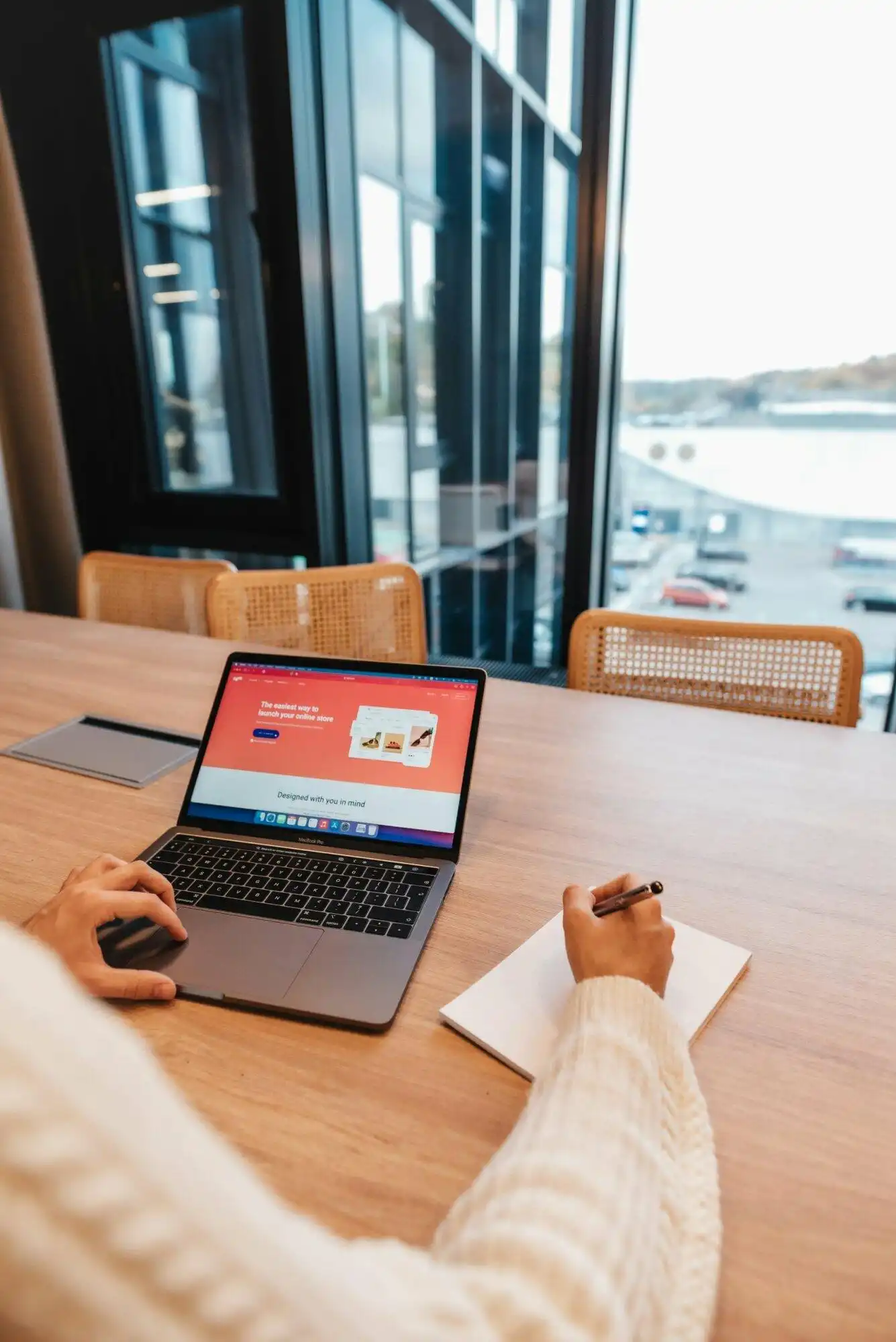
Building a clear website requires careful attention to how content appears on screen and how visitors interact with different pages. When people land on a site, they form opinions within seconds. Making those first moments count relies on structured layouts and readable text. Teams building digital spaces must consider how formatting choices affect overall readability and task completion. According to the Office for National Statistics, clear writing and structured content help visitors find information quickly when visiting a site for a specific task Plain language.
Creating an aesthetically pleasing website design is important for capturing visitor attention and fostering a positive user experience. By prioritizing visual hierarchy, intuitive navigation, and effective white space, you can strengthen your brand and build a lasting connection with your audience. Achieving this balance involves managing text density, color selection, and page structure across multiple devices.
Directing Visitor Attention With Visual Hierarchy
Visual hierarchy organizes page elements so that the human eye naturally travels from the most important information to supporting details. Designers achieve this through strategic variations in size, weight, and color placement. Large headings draw the initial glance, followed by descriptive subheadings and body paragraphs.
When elements compete for attention without a clear order, visitors experience visual clutter. Establishing a predictable reading flow helps users digest information quickly without feeling overwhelmed. This structured approach applies equally to product listings, informational articles, and landing pages.
Providing Adequate Spacing and Negative Space
White space, sometimes called negative space, acts as the breathing room between design elements. Leaving empty areas around text blocks, images, and buttons prevents a page from feeling crowded. Without sufficient spacing, content blocks merge together, making text difficult to scan and comprehend.
Negative space also emphasizes primary calls to action. When a button or purchase link sits inside an uncluttered area, visitors spot it immediately. Good spacing improves legibility and gives each piece of content the visual weight it deserves.
Choosing Cohesive Colors and Readable Typography
Selecting a color palette requires restraint and careful contrast management. Using too many contrasting colors creates visual fatigue and distracts from the core message. Digital teams should maintain sufficient contrast between text and background surfaces to support readability. The World Wide Web Consortium specifies that normal text should maintain a contrast ratio of at least 4.5:1 against its background Web Content Accessibility Guidelines (WCAG) 2.2.
Typography plays an equally important role in shaping brand identity and keeping text readable. Selecting clean font families and appropriate font sizes ensures that visitors can read paragraphs comfortably on both large monitors and compact mobile screens. Text should remain clear and legible even when users enlarge it on their displays.
Ensuring Reliable Cross-Device Responsiveness
Modern web traffic arrives from a wide variety of devices, including desktop computers, tablets, and smartphones. A layout that looks polished on a large monitor may break down completely on a mobile screen if it lacks responsive formatting. Testing services across a range of devices ensures that layouts adapt smoothly to different screen dimensions Make the service simple to use.
Designers must verify that buttons remain large enough to tap easily with a finger and that text wraps correctly without requiring horizontal scrolling. Mobile responsiveness removes friction from user interactions and keeps bounce rates low.
Maintaining Visual Consistency Across Pages
Consistency builds trust and makes a website feel professional and reliable. Using consistent design patterns across all pages helps users understand how to interact with the site without learning new navigation rules each time they click a link Design principles.
Consistent styling applies to heading sizes, button styles, icon sets, and navigational menus. When every page follows the same structural logic, visitors move through the site intuitively, finding the information or products they need without frustration.
What Makes a Website Design Visually Appealing?
Visual appeal stems from a combination of balance, consistent spacing, readable typography, and a restrained color palette. When these elements work together, they create an attractive layout that guides the eye naturally through the content.
How Does Visual Hierarchy Improve Readability?
Visual hierarchy establishes a clear order of importance using size, color, and placement. This arrangement helps visitors scan pages quickly and grasp core messages without having to read every single word.
Why Is White Space Important in Layout Design?
White space provides breathing room between page elements, preventing overcrowding. It makes content pop, reduces cognitive fatigue, and draws focused attention toward key calls to action.
What Are Common Design Mistakes to Avoid?
Frequent pitfalls include overcrowding page elements, using too many competing colors, ignoring mobile responsiveness, and failing to maintain sufficient contrast between text and background areas.
How Do You Test Website Usability Across Devices?
Usability testing involves reviewing page layouts and interactive elements across various smartphones, tablets, and desktop monitors to verify that text remains legible, buttons are easy to tap, and navigation functions smoothly.
Bringing Your Digital Vision Together
Crafting a quality digital destination requires patience, attention to detail, and a clear understanding of your audience. By combining thoughtful typography, balanced layouts, and reliable cross-device responsiveness, you create an environment where visitors feel welcome and valued.
Ready to improve your online presence? Reach out to BKThemes today to explore professional solutions tailored to your unique business goals.
Looking for implementation support? Visit our web development services page for the full service overview.
About the Author

Brian Keary
Founder & Lead Developer
Brian is the founder of BKThemes with over 20 years of experience in web development. He specializes in WordPress, Shopify, and SEO optimization. A proud alumnus of the University of Wisconsin-Green Bay, Brian has been creating exceptional digital solutions since 2003.
Expertise
Writing since 2003