Did you know that by 2026, mobile devices are projected to account for over 85% of all web traffic? Qualtrics, 2026 That’s a staggering number, and it means how your website looks and functions across different screen sizes is no longer a nice-to-have; it's an absolute necessity. As web designers and business owners, we’re constantly navigating the evolving landscape of digital presentation. Two terms that frequently pop up in these discussions are "fluid layouts" and "responsive design." While they both aim to tackle the multi-device challenge, they aren't quite the same beast. Understanding their nuances is key to building a website that not only looks great but also performs exceptionally well.
Who This is For
This guide is for anyone involved in building or managing a website, from seasoned web developers and designers to small business owners and marketing professionals. If you're asking yourself, "How can I ensure my website looks good on a phone, a tablet, and a desktop?" then you're in the right place. It's especially relevant if you're planning a new website build or considering a redesign. Understanding these concepts empowers you to make informed decisions about your site's architecture and user experience. Whether you're a solo entrepreneur or part of a larger team, grasping the distinctions between fluid layouts and responsive design will help you communicate your needs effectively and achieve your online goals.
Who This is NOT For
This article isn't for someone looking for a quick, one-size-fits-all solution without understanding the underlying principles. If you believe "just make it work on mobile" covers all your bases, you might find this too detailed. It’s also not for individuals who have no interest in how their website functions or appears to users. Those who are completely satisfied with a desktop-only experience or have a very niche, non-public-facing application might not find this information directly applicable. Furthermore, if you're not involved in the creation or strategic direction of a website, the technical specifics might be less relevant, though the user experience implications are universally important.
Build something better
Need a developer who can actually ship the fix, feature, or rebuild?
This post is in Web Development, so here’s the most relevant next step if you want help applying it.
We handle custom web development, performance improvements, design upgrades, and ongoing technical support for sites that need more than templates.
- Custom development for WordPress, Shopify, and modern web stacks
- Performance, UX, and conversion-focused improvements
- Hands-on implementation with no pass-the-buck nonsense
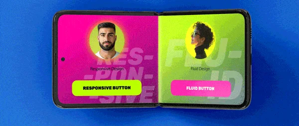
Fluid Layouts: The Flexible Foundation
So, what exactly is a fluid layout? At its core, a fluid layout is a website design that uses relative units, like percentages, for its widths. Instead of fixed pixel values (e.g., width: 960px), a fluid layout might use width: 90%. This means the layout elements will stretch or shrink proportionally as the browser window resizes. Think of it like a liquid; it fills the container it's poured into, adapting its shape. This approach was an early step towards making websites more adaptable.
The primary advantage of fluid layouts is their inherent flexibility. They can adapt to a wide range of screen sizes without requiring distinct breakpoints. This can lead to a smoother, more continuous resizing experience for the user. For instance, a sidebar that’s 30% wide on a large screen will simply become narrower on a smaller screen, maintaining its proportional relationship with the main content area. This simplicity can be appealing, especially for content-heavy sites where maintaining a consistent structure is paramount.
However, fluid layouts have their limitations. While they scale, they don’t necessarily rearrange. On smaller screens, elements that look fine when wide can become excessively tall and narrow, leading to awkward scrolling or unreadable text. Imagine a three-column layout on a desktop. On a mobile device, those three columns might just stack up, but the content within each column might become a long, thin strip that’s difficult to read. This is where the limitations become apparent. The design might fit, but it might not be optimal for the user experience.
Responsive Design: The Intelligent Adaptation
Responsive design takes the concept of adaptability a significant step further. It’s not just about scaling; it’s about responding intelligently to the user's device and screen size. This is achieved through a combination of flexible grids, flexible images, and CSS media queries. Media queries are the secret sauce here. They allow designers to apply different CSS rules based on specific device characteristics, most commonly the screen width.
For example, a responsive design might dictate that on screens wider than 1024px, a website displays a three-column layout with a navigation bar at the top. On screens between 768px and 1023px (typical tablet size), it might switch to a two-column layout with a collapsed navigation menu (a "hamburger" icon). And on screens smaller than 767px (smartphones), it might present a single-column layout with the navigation menu hidden until the user taps the icon. This strategic rearrangement ensures optimal readability and usability across all devices.
The benefits of responsive design are numerous. It provides a superior user experience because the content and layout are optimized for each viewing environment. Search engines also favor responsive design. Google, for instance, strongly recommends responsive design as its preferred method for mobile configuration. This can positively impact your site's search engine rankings. Furthermore, maintaining a single website with a responsive design is generally more cost-effective and easier to manage than creating separate mobile and desktop versions.
Fluid Layouts vs. Responsive Design: A Head-to-Head
Let's break down the key differences more concretely.
| Feature | Fluid Layouts | Responsive Design |
|---|---|---|
| Core Principle | Scales proportionally using relative units. | Adapts layout and content based on screen size. |
| Units Used | Primarily percentages (%). | Percentages, ems, rems, viewport units, and more. |
| Adaptation | Elements resize, but structure remains similar. | Layout, navigation, and content can rearrange. |
| Media Queries | Typically not used. | Essential for defining breakpoints and custom styles. |
| User Experience | Can be good, but may suffer on very small screens. | Generally superior, optimized for each device. |
| SEO Impact | Neutral to positive. | Strongly positive, Google's preferred method. |
| Complexity | Simpler to implement initially. | More complex, requires careful planning and testing. |
A fluid layout is like a stretchy t-shirt; it conforms to your body, but it doesn't change its fundamental shape. A responsive design is more like a transformer toy; it can reconfigure itself into entirely different forms depending on the situation.
The Technical Underpinnings
Implementing a fluid layout often involves setting container widths to percentages. For example:
.container {
  width: 90%; /* Stretches to 90% of its parent */
  margin: 0 auto; /* Centers the container */
}

.column {
  width: 48%; /* Two columns side-by-side, with some space */
  float: left; /* Or use Flexbox/Grid */
  margin-right: 2%;
}
Responsive design, however, adds the crucial element of media queries. Consider this snippet:
/* Default styles (e.g., for mobile-first approach) */
.navigation {
  display: none; /* Hidden by default */
}

/* Styles for screens 768px and wider */
@media (min-width: 768px) {
  .navigation {
    display: block; /* Show navigation */
  }
  .column {
    width: 48%;
    float: left;
    margin-right: 2%;
  }
}

/* Styles for screens 1024px and wider */
@media (min-width: 1024px) {
  .column {
    width: 30%; /* Three columns */
    margin-right: 3.33%;
  }
}
This demonstrates how the same HTML structure can render very differently based on screen width, offering a much more tailored experience. This is why understanding on page seo best practices every web designer should know is vital, as how your content is presented directly impacts user engagement and search visibility.
When to Use Which (or Both!)
In today's digital landscape, pure fluid layouts are rarely sufficient on their own. The vast majority of modern, effective website designs employ responsive design. Responsive design inherently includes fluid principles – it uses flexible grids and images that scale. However, it goes beyond simple scaling by using media queries to make structural changes.
You might encounter a situation where a mostly fluid layout is desired, but with minor adjustments. For instance, perhaps you want a large hero image to always maintain its aspect ratio, regardless of screen size, without breaking the layout. This is where fluid image techniques come into play, often within a responsive framework.
The best practice for nearly all websites in 2026 is to implement a full responsive design strategy. This ensures your site is future-proof and provides an optimal experience for every potential visitor, whether they're browsing on a cutting-edge smartphone or a large, high-resolution desktop monitor. Think about the Top 5 hurdles website redesign your expert guide and how a well-executed responsive strategy can help you leap over many of them.
Mistakes to Avoid
As we embrace these flexible design approaches, there are common pitfalls to steer clear of.
- Ignoring Mobile-First: Designing for desktop and then trying to cram it onto mobile is a recipe for disaster. Start with the smallest screen and build up. This forces you to prioritize content and functionality.
- Fixed-Width Elements: Even within a fluid or responsive design, using fixed pixel widths for crucial elements can break your layout on certain screens. Always consider how elements will behave when scaled.
- Unoptimized Images: Large, uncompressed images can cripple your site's loading speed, especially on mobile connections. Use responsive image techniques (like
srcset) and proper compression. - Overly Complex Breakpoints: While media queries offer great control, too many intricate breakpoints can make your CSS difficult to manage and test. Aim for logical, content-driven breakpoints.
- Neglecting Usability Testing: A design might look good on your own devices, but real users interact with websites in unpredictable ways. Test rigorously on various devices and screen sizes. This is part of the Seo Mistakes Web Designers 2025 that can be easily overlooked.
- Not Considering Performance: Fluid and responsive techniques, if not implemented efficiently, can sometimes lead to performance issues. Always optimize your code and assets. Checking if Does Clean Code Improve SEO? A Web Designer’s Perspective can offer valuable insights here.
Actionable Checklist for Responsive Design
Ready to implement or audit your site's responsiveness? Follow this checklist:
- Define Your Breakpoints: Identify key screen widths where your layout needs to adapt (e.g., phone, tablet, small desktop, large desktop).
- Mobile-First Approach: Start designing and coding for the smallest screen size first.
- Flexible Grid System: Utilize CSS Grid or Flexbox for robust, adaptable layouts.
- Fluid Images & Media: Ensure images, videos, and other media scale proportionally. Use
max-width: 100%; height: auto;. - Media Queries Implementation: Use
min-widthmedia queries to add complexity as screen size increases. - Navigation Adaptation: Design how your navigation will transform for different screen sizes (e.g., hamburger menu).
- Typography Readability: Adjust font sizes and line heights for optimal reading on all devices.
- Touch Target Sizes: Ensure buttons and links are large enough and spaced adequately for touch interaction.
- Performance Optimization: Compress images, minify CSS/JS, and leverage browser caching.
- Cross-Browser & Cross-Device Testing: Test thoroughly on various browsers (Chrome, Firefox, Safari, Edge) and devices (iOS, Android, different desktop resolutions).
- Accessibility Check: Ensure your responsive design is accessible to users with disabilities.
- Review The ultimate on page seo checklist for designers: Integrate responsive design principles with overall SEO best practices.
FAQs
What is the fundamental difference between fluid and responsive design?
The core distinction lies in how they adapt. Fluid layouts primarily resize elements proportionally using percentages, maintaining a similar structural arrangement across screen sizes. Responsive design, on the other hand, uses media queries to fundamentally alter the layout, content, and styling based on specific screen dimensions, offering a more tailored and optimized experience.
Can a website be both fluid and responsive?
Yes, absolutely! Responsive design is built upon fluid principles. It uses flexible grids (fluid) and then applies media queries to make structural changes, creating a truly responsive experience. You can't really have effective responsive design without some degree of fluidity.
Which approach is better for SEO?
Responsive design is overwhelmingly better for SEO. Search engines, particularly Google, strongly prefer responsive websites because they offer a consistent URL and HTML source, making it easier for crawlers to index. This leads to improved search rankings and a better user experience, which indirectly boosts SEO.
Are fluid layouts outdated?
While pure fluid layouts without responsive elements are less common and often insufficient for modern web needs, the principles of fluidity (using relative units) are still fundamental to responsive design. So, they aren't entirely outdated, but they are rarely used in isolation for a complete website solution.
How do I test if my website is responsive?
You can test your website's responsiveness in several ways. Use your browser's developer tools (usually accessed by pressing F12) to simulate different device sizes. You can also visit your site on actual mobile phones and tablets. Online responsive testing tools are also available, though real device testing is always the most reliable method.
Conclusion
Navigating the world of web design means staying abreast of how users access information. While fluid layouts laid important groundwork, responsive design has emerged as the sophisticated, user-centric, and SEO-friendly standard for 2026 and beyond. It’s not just about making your website fit on different screens; it’s about making it work optimally for every user, regardless of their device. By embracing responsive design principles, you're investing in a flexible, adaptable, and future-proof online presence that will serve your audience and your business effectively. If you're embarking on a new project or a redesign, prioritize a robust responsive strategy. It’s a cornerstone of professional web design today, reflecting a deep understanding of user needs and the digital ecosystem. For more insights into creating effective web designs, exploring resources from professionals like BK Themes | Professional Web Designers can provide valuable guidance.
Key Takeaways
- Fluid Layouts: Use relative units (%) for proportional scaling. They adapt but don't typically rearrange structure.
- Responsive Design: Combines fluid grids with media queries to adapt layout, content, and styling for optimal viewing on various devices.
- User Experience: Responsive design offers a superior, tailored experience across all screen sizes.
- SEO: Responsive design is Google's preferred method, leading to better search rankings.
- Modern Standard: Responsive design is the industry standard for new websites and redesigns.
- Testing is Crucial: Always test your responsive implementation across multiple devices and browsers.
Looking for implementation support? Visit our web development services page for the full service overview.
📧 Want to Stay Updated?
Get the latest web development tips and insights delivered to your inbox.
🚀 What Services do you Offer?
About the Author

Brian Keary
Founder & Lead Developer
Brian is the founder of BKThemes with over 20 years of experience in web development. He specializes in WordPress, Shopify, and SEO optimization. A proud alumnus of the University of Wisconsin-Green Bay, Brian has been creating exceptional digital solutions since 2003.
Expertise
Writing since 2003


