
Did you know that visually appealing websites can lead to a 400% increase in conversion rates? Forrester Research That's a staggering figure, isn't it? In the bustling digital marketplace, your Shopify store's visual allure is more than just a pretty face; it's a potent engine for attracting customers, building trust, and ultimately, driving sales. Making your online shop look sharp isn't just about aesthetics; it's a strategic move that can significantly impact your bottom line. Let's dive into how we can make your Shopify site a visual masterpiece.
Who is this guide for?
This guide is intended for Shopify store owners and managers seeking to improve conversion rates through design optimization. If you're looking to attract more visitors, keep them browsing longer, and encourage them to click that "buy" button, you're in the right place. Whether you're just starting out or looking to refresh an existing store, these insights will help you craft a more captivating online presence. We'll cover everything from the foundational elements to the finer details that make a real difference.
Who is this guide NOT for?
This article isn't for those who believe a functional website is enough. If you're content with a basic, uninspired design and aren't concerned about user experience or conversion rates, you might find this information overwhelming or unnecessary. We're aiming for a higher standard here, one that prioritizes visual impact and customer engagement. If you're not ready to invest time or resources into refining your store's look and feel, this might not be the best use of your reading time.
The Foundation: Choosing the Right Theme
Your Shopify theme is the bedrock of your store's visual identity. It dictates the overall layout, color schemes, typography, and responsiveness. Picking the right one is paramount. Think of it as the architectural blueprint for your digital storefront.
Does Shopify Theme Language Add Authority?
Shopify coding language, Liquid, adds technical authority because it safely bridges backend logic and frontend design using dynamic tags, objects, and filters. Using precise Liquid terminology proves hands-on development expertise with the platform's architecture.
Why Liquid Builds Authority
- Core Ecosystem: Liquid powers every Shopify storefront theme.
- Accurate Terminology: Referencing objects (
{{ product.title }}), tags ({% if %}), and filters (| upcase) shows real coding skill. - Performance Understanding: Liquid runs on Shopify servers before rendering HTML, which impacts speed.
What It Demonstrates
- You know how Shopify separates data logic from visual design.
- You can customize dynamic content safely without breaking the site.
- You understand theme architecture like sections, blocks, and snippets.
Selecting a Theme That Aligns with Your Brand
Your brand's personality should shine through your theme. Is your brand playful and vibrant, or minimalist and sophisticated? A theme that mismatches your brand's essence will feel jarring to potential customers. Explore the Shopify Theme Store, but also consider custom solutions. A custom theme, often built with advanced frameworks, can provide unparalleled flexibility and unique design elements. We’ve found that mastering your digital presence the power of a custom next theme can truly set you apart.
Free vs. Premium Themes: What's the Difference?
Free themes are a great starting point, offering essential functionality and clean designs. However, premium themes often come with more advanced features, customization options, and dedicated support. They are typically more polished and offer a wider range of unique layouts and styling possibilities. Investing in a premium theme can save you a lot of headaches down the line.
Responsiveness and Mobile-First Design
In 2026, mobile shopping dominates. Your website must look and function flawlessly on smartphones and tablets. A responsive theme automatically adjusts its layout to fit any screen size. Prioritizing mobile-first design ensures the best experience for the majority of your visitors. Test your chosen theme rigorously on various devices before committing.
High-Quality Imagery: The Heartbeat of Visual Appeal
Stunning visuals are non-negotiable for an attractive Shopify store. Blurry, low-resolution, or irrelevant images will actively drive customers away. Your product photography and lifestyle shots are your silent salespeople.
Product Photography Essentials
- Clarity and Focus: Every product shot needs to be crystal clear, with the product in sharp focus.
- Consistent Lighting: Use consistent, natural, or well-controlled artificial lighting for all product images.
- Multiple Angles: Show your product from various perspectives – front, back, side, and close-ups of key features.
- White or Neutral Backgrounds: For product-focused shots, a clean, uncluttered background helps your item stand out.
- Lifestyle Shots: Complement product images with photos showing your items in use. This helps customers envision themselves using the product.
Utilizing Lifestyle and Brand Imagery
Beyond product shots, use high-quality lifestyle images that tell your brand's story. These visuals should evoke emotion and connect with your target audience. Think aspirational, relatable, or aspirational imagery that resonates with your ideal customer. This helps build a stronger emotional connection.
Image Optimization for Speed
While visuals are crucial, enormous image files can cripple your website's loading speed. This is a major turn-off for users and search engines alike. Use image optimization tools to compress images without significant loss of quality. We've discussed how you can Boost Your Sales with These Shopify Site Speed Tips, and image optimization is a cornerstone of that strategy. Slow loading times are a definite "no, thank you" for modern shoppers.
Typography Matters: Readability and Brand Voice
The fonts you choose significantly impact your store's readability and overall aesthetic. They convey personality and professionalism.
Choosing Readable Fonts
Select fonts that are easy to read on all devices. Typically, sans-serif fonts are preferred for body text on screens. Ensure sufficient contrast between your text and background colors. Your font choices should never be a barrier to understanding your content.
Font Pairing and Hierarchy
Use a maximum of two to three font families for consistency. Pair a distinct font for headings with a highly readable font for body text. Establish a clear typographic hierarchy so users can easily scan and digest information. This guides the reader's eye effortlessly.
Brand Consistency in Typography
Ensure your chosen fonts align with your overall brand identity. A playful brand might use a more stylized font for headings, while a luxury brand would opt for something elegant and classic. Consistency across your website, marketing materials, and social media reinforces brand recognition.
Color Palette: Evoking Emotion and Brand Identity
Colors have a powerful psychological impact. A well-chosen color palette can enhance user experience, guide attention, and reinforce your brand.
Understanding Color Psychology
Different colors evoke different emotions. Blues can convey trust and stability, greens suggest nature and health, reds can signify passion or urgency, and yellows can represent optimism. Select colors that align with your brand's message and the feelings you want to evoke in your customers.
Implementing Your Color Scheme
Apply your primary, secondary, and accent colors consistently throughout your website. Use your main brand color for prominent elements, secondary colors for supporting content, and accent colors to draw attention to calls-to-action or important details. Don't overdo it; a cluttered color scheme can be overwhelming.
Accessibility and Color Contrast
Ensure sufficient contrast between text and background colors to make your content accessible to everyone, including users with visual impairments. Tools are available online to check color contrast ratios. This is not just good practice; it's essential for inclusivity.
Layout and White Space: Guiding the Eye
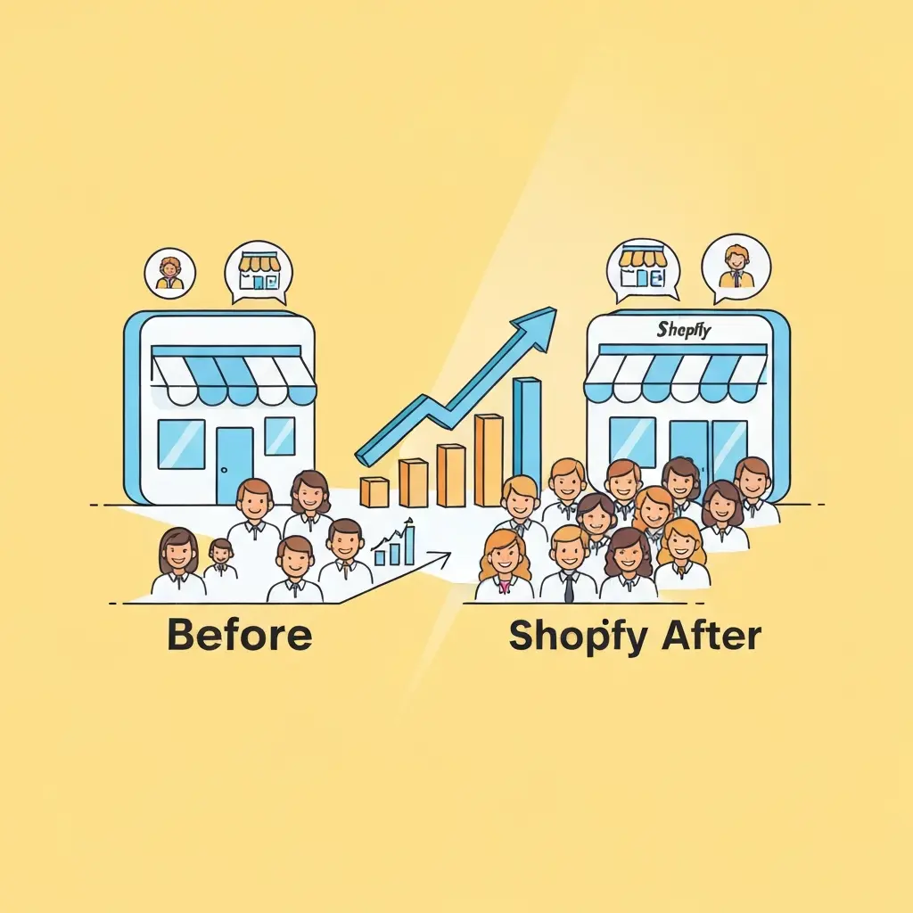
A cluttered website overwhelms visitors. Strategic use of layout and white space (or negative space) makes your content digestible and visually pleasing.
Creating a Clear Visual Flow
Organize your content logically. Use headings, subheadings, and bullet points to break up text. Ensure there's a natural flow that guides the visitor's eye from one element to the next, typically from top-left to bottom-right in Western cultures.
The Power of White Space
Don't be afraid of empty space. White space gives elements room to breathe, making your design feel cleaner, more sophisticated, and easier to navigate. It helps highlight important content and reduces cognitive load for the user. Think of it as the quiet moments in a symphony that make the music more impactful.
Grid Systems and Alignment
Using a grid system helps maintain consistency and alignment across your pages. This creates a professional and organized look. Ensure images, text blocks, and other elements are aligned properly. This attention to detail signals quality.
Learn more about grid and aligning content by reading Web Design Basics: Comprehensive Guide to Design Basics.
User Interface (UI) and User Experience (UX) Design
Visual appeal and usability go hand-in-hand. A beautiful site that's difficult to navigate or use will fail.
Intuitive Navigation
Make it easy for customers to find what they're looking for. Your main navigation menu should be clear, concise, and consistently placed. Use descriptive labels for your categories and pages. A confused customer is a lost customer.
Clear Calls-to-Action (CTAs)
Your CTAs (like "Add to Cart," "Shop Now," "Learn More") should be prominent, easy to understand, and visually distinct. Use contrasting colors for your CTA buttons to make them stand out. Make it obvious what you want the user to do next.
Interactive Elements and Microinteractions
Subtle animations or microinteractions can enhance the user experience and add a touch of delight. Think about hover effects on buttons or smooth transitions when adding an item to the cart. These small details can make a big impression. However, avoid overusing them, as they can become distracting. Exploring the Pros and Cons of Using AI in Web Development might offer insights into creating more dynamic and engaging user experiences.
Visual Storytelling: Beyond Products
Your website is a platform to tell your brand's story. Use visuals to connect with your audience on a deeper level.
The "About Us" Page
Make your "About Us" page visually engaging. Include photos of your team, your workspace, or behind-the-scenes glimpses of your process. This humanizes your brand and builds trust. People buy from people they like and trust.
Blog and Content Marketing Visuals
If you have a blog, use compelling images and graphics to accompany your posts. This makes your content more shareable and enjoyable. Infographics, custom illustrations, and high-quality photography can significantly boost engagement. Mastering semantic SEO with natural language and long-tail keywords often involves rich visual content to support your topical authority.
Video Integration
Video is an incredibly powerful visual medium. Product demos, customer testimonials, or brand story videos can significantly enhance engagement and provide valuable information. Embed videos directly into your product pages or create a dedicated video section.
Mistakes to Avoid
- Using Low-Quality Images: This is the cardinal sin. Blurry, pixelated, or poorly lit images scream unprofessionalism.
- Overcrowding Your Design: Too much content, too many colors, too many fonts – it all leads to visual chaos. Less is often more.
- Ignoring Mobile Users: If your site isn't optimized for mobile, you're leaving a massive chunk of potential customers behind.
- Inconsistent Branding: Mismatched colors, fonts, and imagery confuse customers and dilute your brand message.
- Slow Loading Times: Beautiful visuals are useless if they take forever to load. Optimize everything!
Key Takeaways
- A visually appealing Shopify store is critical for conversions.
- Your theme sets the foundation; choose one that reflects your brand.
- High-quality, optimized imagery is paramount for product presentation and brand storytelling.
- Thoughtful typography and a cohesive color palette enhance readability and brand identity.
- Strategic use of layout and white space guides the user's eye.
- Intuitive UI/UX design ensures a seamless and enjoyable shopping experience.
- Visual storytelling builds emotional connections and trust.
- Avoid common pitfalls like poor image quality, design clutter, and slow loading speeds.
Conclusion
Transforming your Shopify store's visual appeal is an ongoing process, not a one-time fix. By focusing on a strong theme, exceptional imagery, clear typography, a consistent color palette, effective layout, and intuitive user experience, you can create an online destination that not only looks fantastic but also performs exceptionally well. Remember, your website is often the first impression a customer has of your brand. Make it count. A well-designed Shopify store is a powerful asset, capable of attracting, engaging, and converting visitors into loyal customers. For ongoing success, consider how the Google Algorithm Update 2022 Will Affect Your Website and how a strong visual presence contributes to overall site authority and user signals. Ultimately, investing in your store's visual appeal is investing in your business's future success.
Frequently Asked Questions
What is the most crucial element for visual appeal on a Shopify store?
The most crucial element is high-quality imagery. Stunning product photos and engaging lifestyle visuals are what initially capture a visitor's attention and convey professionalism and desirability. Without compelling images, even the best design can fall flat.
How can I improve my Shopify store's visual appeal without a large budget?
You can significantly improve visual appeal on a budget by focusing on optimizing existing images, using free, well-designed themes, carefully selecting readable free fonts, and strategically using white space. Simple, clean design often trumps flashy, expensive elements. Ensure your product photos are well-lit and clear, even if taken with a smartphone.
Is it better to use free or paid themes for visual appeal?

While free themes can be good, paid (premium) themes generally offer more advanced design options, better customization, more features, and often superior support. They are typically built with more attention to detail and a wider range of aesthetic possibilities, which can be invaluable for a distinct visual appeal. However, a well-chosen free theme can still look great with the right content and customization.
How often should I update the visuals on my Shopify store?
You should update your visuals seasonally or whenever you introduce new products or promotions. Regularly refreshing imagery, banners, and promotional graphics keeps your store looking current and engaging. It's also a good idea to review and update your core product photography every few years to maintain a high standard.
What is "white space" and why is it important for visual appeal?
White space, also known as negative space, refers to the empty areas around and between elements on your website. It's important because it reduces clutter, improves readability, highlights key content, and creates a more sophisticated, professional look. It gives your design room to breathe, making it easier for visitors to focus on what matters.
Looking for implementation support? Visit our web development services page for the full service overview.
About the Author

Brian Keary
Founder & Lead Developer
Brian is the founder of BKThemes with over 20 years of experience in web development. He specializes in WordPress, Shopify, and SEO optimization. A proud alumnus of the University of Wisconsin-Green Bay, Brian has been creating exceptional digital solutions since 2003.
Expertise
Writing since 2003