
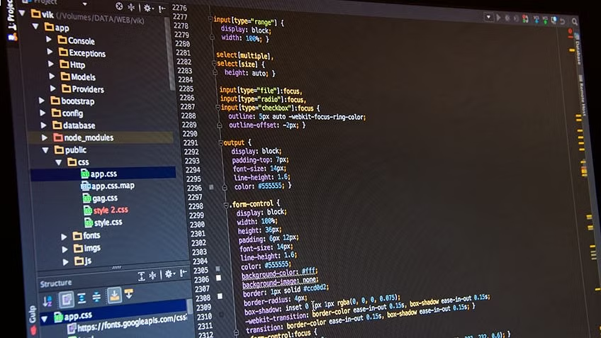
Did you know that CSS has evolved from a simple styling language into a powerful engine capable of handling complex layout logic and high-performance animations? In 2026, the landscape of web development is vastly different from the early days of the internet. Developers no longer rely on clunky hacks or outdated tables to structure their sites. Instead, modern CSS3 provides a robust suite of tools that allow for precision, responsiveness, and creativity. Whether you are working with frameworks like React, Vue, or Angular, or building a bespoke interface from scratch, understanding the core components of CSS3 is essential for building professional, high-performing websites.
Precision Targeting with Advanced Selectors
The foundation of any great stylesheet is the ability to target specific elements accurately. CSS3 selectors allow developers to pinpoint HTML elements based on their type, class, ID, or unique attributes without cluttering the markup with unnecessary tags. By utilizing these selectors, you keep your code clean and maintainable.
Combinators take this precision further by defining the relationship between elements. Using the space operator, child selector (>), adjacent sibling selector (+), and general sibling selector (~), you can style elements based on their position in the document hierarchy. This is particularly useful when dealing with dynamic content generated by JavaScript. Furthermore, pseudo-classes like :hover, :active, and :focus allow you to react to user input, creating an interactive experience. If you need to inject decorative elements without modifying your HTML, pseudo-elements such as ::before and ::after are perfect for adding icons, borders, or text content dynamically.
Mastering Layout Systems: Flexbox and Grid
For years, developers struggled with layout techniques like floats and positioning. Today, CSS3 offers two sophisticated systems that have revolutionized how we structure pages.
Flexbox is the go-to solution for one-dimensional layouts. It excels at distributing space and aligning items along a single axis, making it ideal for navigation bars, buttons, and card components. It is incredibly effective at handling alignment issues that once required tedious calculations in px or em units. You can learn more about the evolution of these standards at W3C.
On the other hand, CSS Grid is a powerful two-dimensional system. It allows you to manage both rows and columns simultaneously, giving you total control over the structure of your page. While Flexbox is about content-first alignment, Grid is about layout-first architecture. By combining these two systems, you can create complex, responsive designs that adapt seamlessly to any screen size. If your project requires advanced layout optimization, BKThemes offers professional services for website performance and development to ensure your structure is as efficient as it is beautiful.
Bringing Interfaces to Life with Motion
Static websites are a thing of the past. Modern users expect fluid, responsive feedback, and CSS3 delivers this through transitions, transforms, and animations.
Transitions are the simplest way to add polish to your site. By defining a duration in ms, you can make property changes—such as background color shifts or size adjustments—happen smoothly rather than abruptly. Transforms take this further by allowing 2D and 3D modifications. You can rotate, scale, skew, or translate elements to create eye-catching effects that feel natural and intuitive.
For more complex movements, CSS3 animations allow you to define keyframes. This gives you granular control over the sequence of an animation, allowing for multi-step transitions that run automatically or trigger on specific events. These features are vital for creating engaging user interfaces that feel modern and high-end. To understand the underlying concepts of how browsers render these styles, you can read more about web standards.
Why Best Practices Matter
While the technical capabilities of CSS3 are impressive, the way you implement them dictates your site's long-term health. Writing efficient CSS is not just about aesthetics; it is about performance and search engine optimization. Search engines, such as those discussed on Wikipedia, prioritize sites that load quickly and provide a good user experience.
Using modern features appropriately ensures that your stylesheets remain lightweight. Avoid over-nesting selectors, which can lead to performance bottlenecks, and leverage browser-native features like Grid and Flexbox instead of relying on heavy external libraries. If you are looking to refine your technical stack, BKThemes provides expert support for SEO and performance tuning, helping you bridge the gap between creative design and technical excellence. Remember, this guide assumes a foundational understanding of HTML and basic CSS, so always test your implementations across different browsers to ensure consistent behavior.
What are the primary benefits of using CSS3?
CSS3 introduces modular features that allow for more complex designs without relying on JavaScript. It offers better performance, improved browser support, and a vast array of tools for layout, animation, and responsive design, making it easier to build professional-grade websites.
How do Flexbox and CSS Grid differ?
The main difference lies in their dimensionality. Flexbox is a one-dimensional system, meaning it handles either a row or a column at a time. CSS Grid is a two-dimensional system, enabling you to control both rows and columns together, which is far more efficient for complex page structures.
Can CSS3 animations replace JavaScript?
For many tasks, yes. Simple hover effects, transitions, and even complex keyframe-based animations can be handled entirely by CSS3. This is often more performant because CSS animations are optimized by the browser's rendering engine, whereas JavaScript animations can sometimes cause main-thread bottlenecks.
What are pseudo-elements used for?
Pseudo-elements like ::before and ::after are primarily used for adding decorative content to the page without altering the HTML structure. This is excellent for inserting icons, creating custom bullet points, or adding background shapes that enhance the visual appeal of the site.
Does CSS3 affect SEO performance?
Yes. Clean, efficient CSS reduces the file size of your stylesheets, which improves page load speed. Fast load times are a critical ranking factor for search engines. Furthermore, using semantic HTML combined with modern CSS layout techniques helps crawlers understand the hierarchy and content of your page more effectively.
When should I seek professional development help?
If you are struggling with complex layout issues, performance bottlenecks, or maintaining a large codebase, seeking professional assistance is a smart move. BKThemes specializes in high-performance web development and SEO, ensuring your site remains fast and accessible as it grows.
Looking for implementation support? Visit our web development services page for the full service overview.
About the Author

Brian Keary
Founder & Lead Developer
Brian is the founder of BKThemes with over 20 years of experience in web development. He specializes in WordPress, Shopify, and SEO optimization. A proud alumnus of the University of Wisconsin-Green Bay, Brian has been creating exceptional digital solutions since 2003.
Expertise
Writing since 2003