
Website navigation menus establish the structural hierarchy of a digital property, directing users to high-priority pages and enabling search engines to crawl content efficiently. According to web credibility research, over 75% of users evaluate site trustworthiness based on design and intuitive navigation. Stanford Web credibility research supports this claim. Implementing structured menu architecture reduces bounce rates, optimizes internal link equity, and increases organic conversion rates.
Key Takeaways
- A navigation menu is crucial for user experience, SEO, and conversions.
- WordPress menus are managed under Appearance > Menus.
- You can add Pages, Posts, Custom Links, and Categories to your menus.
- Menu items can be reordered and nested to create sub-menus.
- Menus must be assigned to theme locations (e.g., Primary, Footer) to be displayed.
- Customize menu appearance via the WordPress Customizer or custom CSS.
- Advanced options like CSS Classes and Link Target can be enabled via "Screen Options."
- Keep menus simple, use clear labels, and ensure mobile responsiveness.
- Avoid common mistakes like overcrowding, vague text, and neglecting accessibility.
- Consider mega menus or off-canvas menus for complex sites.
- Remember to save your menu after making any changes.
Why Is Strategic Navigation Critical for Web Usability?
Strategic website navigation acts as the structural backbone of a user’s experience, directly impacting how visitors interact with a site, perceive the brand, and complete high-value actions.
1. Reduces Cognitive Load & Friction
When navigation is predictable and logical, users can find information effortlessly without having to figure out how the site works. Clear labeling and organized hierarchies allow visitors to scan options quickly, preventing frustration and lowering drop-off (bounce) rates.
2. Guides the User Journey & Boosts Conversions
A well-designed menu strategically directs users toward key conversion points—such as product categories, contact forms, or booking links. Placing call-to-action (CTA) buttons directly in the primary header keeps business goals visible across every page.
3. Establishes Brand Credibility & Trust
Users form rapid judgments about a site's legitimacy based on design and usability. An intuitive, polished navigation structure reassures visitors that the business is professional and dependable, whereas broken, hidden, or confusing menus erode trust.
4. Improves Search Engine Optimization (SEO)
Search engine crawlers rely on site architecture to discover, map, and index pages efficiently. Strategic internal linking within menus communicates page relationships, topic depth, and visual hierarchy to search algorithms, directly supporting search visibility.
5. Ensures Accessibility & Mobile Responsiveness
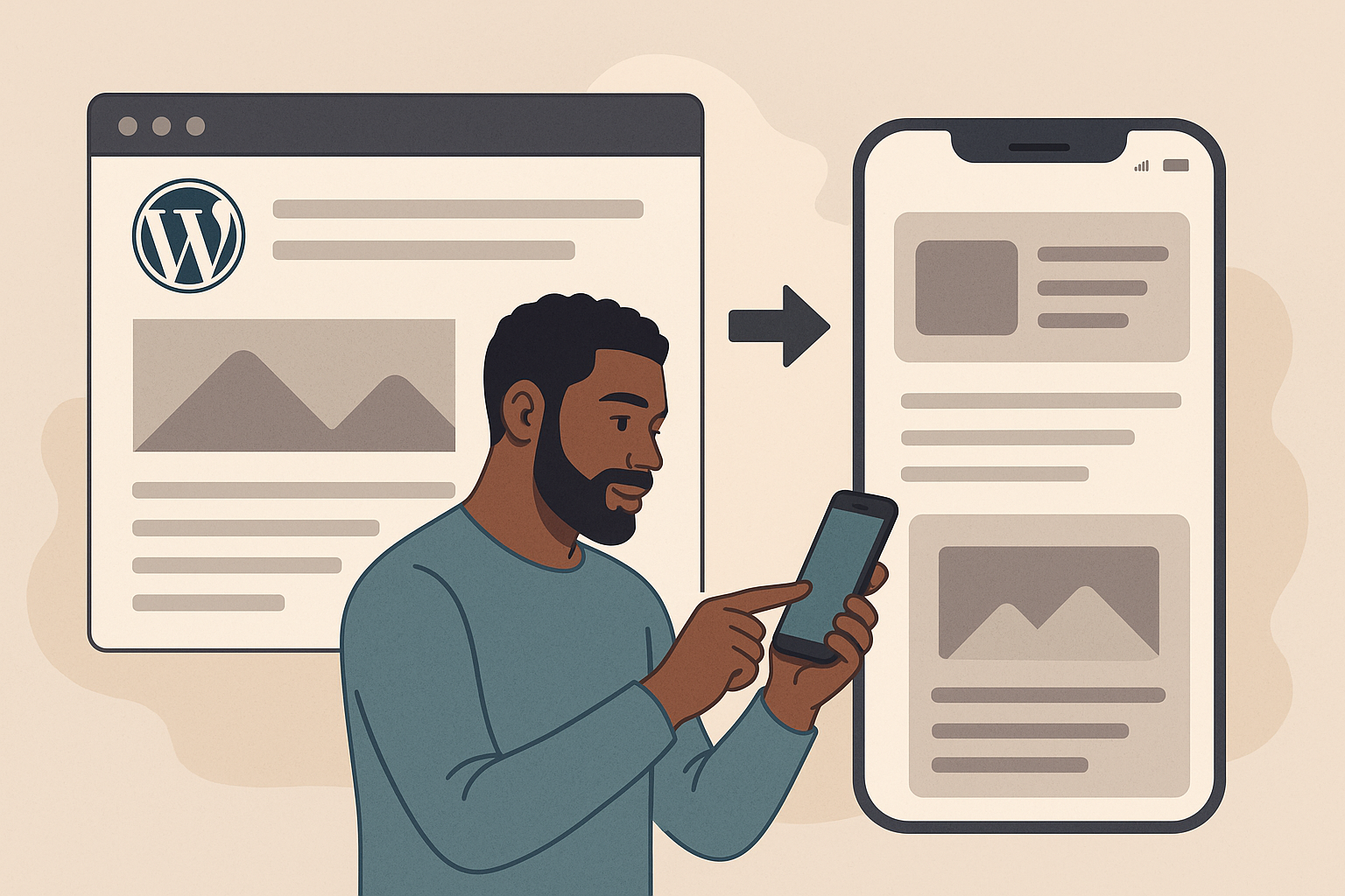
Strategic navigation ensures that content remains fully accessible across all device types and screen sizes. By utilizing responsive design patterns—such as touch-friendly off-canvas or hamburger menus on mobile screens—sites cater seamlessly to mouse users, mobile shoppers, and screen-reader users alike.
What Are the Main Website Navigation Menu Types?
Website navigation menu types can be categorized by their positioning, behavioral display, or content scope. Below are the primary types used in modern web design:
1. Header & Primary Navigation Types
These are the core menus visible at the top of a website that guide visitors to main high-level categories.
- Top Horizontal Bar: The standard layout placed at the top header of a page. It lists primary links in a single row for quick scanning on desktop screens.
- Dropdown / Flyout Menu: Triggers when a user hovers over or clicks a primary category link, revealing a nested list of subcategories without forcing a page reload.
- Mega Menu: An expanded dropdown panel that organizes large numbers of links into multi-column layouts, often incorporating images, promo banners, or short descriptions (common on large e-commerce sites like Amazon or Target).
- Sticky / Fixed Navigation: Remains locked to the top of the browser viewport as the user scrolls down the page, providing continuous access to key site links.
2. Secondary & Structural Navigation Types
These complement the main header menu by organizing secondary pages, deep content hierarchies, or site utility functions.
- Sidebar Navigation: Located along the left or right side of a content area. Frequently used on blogs, documentation portals, platforms with deep category trees, and administrative dashboards.
- Footer Menu: Positioned at the very bottom of every page. Contains comprehensive utility links, legal disclosures (Privacy Policy, Terms), contact details, social media links, and site maps.
- Breadcrumb Trail: A contextual horizontal text list (e.g., Home > Electronics > Audio > Headphones) that shows the user’s exact location within a site hierarchy and lets them step back to higher categories.
3. Mobile & Off-Canvas Navigation Types
Designed specifically for smaller screens or minimal UI approaches.
- Hamburger Menu: Hides the main navigation behind a compact three-line icon ("hamburger"). Clicking or tapping the icon opens a slide-out overlay or drawer.
- Off-Canvas / Push Menu: A panel that slides in from the left or right edge of the screen, pushing or overlaying the main page content to conserve screen real estate.
- Bottom Bar Navigation: Positioned fixed at the bottom of mobile screens, mimicking native mobile app navigation for easy thumb reach.
How Do You Optimize Navigation Menus for UX and Conversions?
Optimizing website navigation requires balancing user experience (UX)—making information frictionless to find—with conversion rate optimization (CRO)—guiding users toward high-value business actions.
1. Structure for Scannability & Hierarchy
- Limit Primary Menu Items: Stick to 5 to 7 main items. According to Miller’s Law, human short-term memory can comfortably process only a few chunks of information at a time.
- Capitalize on the Serial Position Effect: Place your most important pages at the beginning (e.g., Products/Services) and end (e.g., Contact or CTA button) of the menu bar, as users naturally remember the first and last items best.
- Use Mega Menus for Complex Sites: For stores or content-heavy sites, mega menus visually organize subcategories into clean columns with images or icons, preventing long, intimidating single-column dropdowns.
2. Standardize Menu Labels (Prioritize Clarity Over Cleverness)
- Use Common Descriptive Terms: Avoid internal jargon or creative labels like "Our Universe" when you mean "About Us". Clear labels improve predictability and help users scan instantly.
- Incorporate High-Intent Keywords: Use clear, search-friendly labels (e.g., "Men's Running Shoes" instead of "Footwear") to match user search intent and support SEO.
3. Integrate Conversion-Driven Call-to-Actions (CTAs)
- Style a Dedicated CTA Button: Convert your highest-priority conversion link (e.g., "Get Started", "Book a Demo", or "Shop Now") into a distinct, high-contrast button placed on the far right of the header bar.
- Highlight Promotional Content in Mega Menus: Feature direct links to bestselling products, new arrivals, seasonal promotions, or free trials inside dropdown panels to capture immediate interest.
4. Optimize for Mobile & Touch Interfaces
- Implement Responsive Patterns: Use a slide-out off-canvas drawer or hamburger menu on mobile devices to keep the viewport clean.
- Provide Comfortable Touch Targets: Ensure tap targets are at least 48×48 pixels with adequate spacing so mobile users don't accidentally click the wrong link.
- Consider Sticky Bottom Navigation: For mobile app-like browsing, place critical action icons (e.g., Search, Cart, Account, Menu) fixed at the bottom within thumb-reach.
5. Enhance Interactive Visual Feedback
- Indicate Hover & Active States: Use subtle color changes, underline transitions, or background highlights so users know which link they are hovering over and where they are currently located on the site.
- Incorporate Breadcrumb Trails: On deep interior pages or product listings, provide a secondary breadcrumb navigation bar (Home > Category > Product) so visitors can easily retrace their steps without using the back button.
6. Test and Continuously Refine
- Analyze Click Heatmaps & Navigation Analytics: Review tools like Google Analytics, Hotjar, or Clarity to identify which menu links drive the most traffic and which are completely ignored.
- A/B Test Layouts & Copy: Experiment with different menu item orders, CTA button copy, and label naming conventions to measure direct impacts on bounce rate and conversion metrics.
When Should You Conduct a Navigation Architecture Audit?
A navigation architecture audit evaluates your website’s site map, labeling, hierarchy, and menu UX to ensure users (and search engine crawlers) can navigate efficiently.
Conduct a navigation architecture audit during these key triggers and scenarios:
1. Before a Major Website Redesign or Platform Migration
- Why: Redesigning or moving platforms (e.g., WordPress to Shopify) without auditing navigation risks transferring existing UX flaws or breaking established internal linking structures.
- Goal: Establish a clean baseline site map and menu hierarchy before writing new code or building design mockups.
2. When Experiencing High Bounce Rates or Low Conversion Metrics
- Why: High bounce rates on key landing pages or sudden drops in funnel completion often signal that users can't find expected next steps or product categories.
- Goal: Identify navigation friction points, confusing labels, or hidden Call-to-Action (CTA) elements using behavioral analytics, heatmaps, and user testing.
3. After Expanding Products, Services, or Content Libraries
- Why: Rapid business growth frequently leads to "navigation creep"—adding links haphazardly over time without updating the overarching structure.
- Goal: Reorganize sprawling subcategories into logical mega menus or streamlined parent categories to keep choices under 5 to 7 primary links.
4. Following a Significant Drop in Search Engine Rankings or Organic Traffic
- Why: Search engine crawlers rely on site architecture to index and rank pages correctly. Orphaned pages, broken links, or overly deep page hierarchies harm SEO performance.
- Goal: Optimize internal linking distribution and ensure high-priority target landing pages are reachable within 2 to 3 clicks from the main menu.
5. During Periodic UX and Accessibility Maintenance (Annual/Bi-Annual)
- Why: Web standards, user habits, and device screen formats evolve continuously. Regular audits ensure compliance with updated WCAG accessibility standards (e.g., keyboard navigation and screen-reader usability).
- Goal: Verify that mobile off-canvas menus, sticky headers, and tap target sizes function seamlessly across newly updated operating systems and browsers.
Why should navigation menus be simple?
Simplicity reduces the cognitive load on your visitors. When a menu is too complex, users have to spend more time thinking about where to click, which often leads to frustration and abandonment. A simple, logically organized menu allows users to find information intuitively and quickly.
How do mobile-friendly menus differ from desktop versions?
Mobile-friendly menus are designed to work with touch interfaces and limited screen space. While desktop sites use horizontal bars, mobile sites typically utilize "hamburger" menus or bottom-navigation bars, which ensure that links remain clickable and visible without obscuring the main content.
Can I have multiple menus on one website?
Yes, absolutely. Many modern websites use a primary header menu for main categories, a secondary menu for utility links like "Login" or "Support," and a footer menu for legal and contact information. This is a common practice in WordPress development to organize content effectively.
What is the benefit of adding a CTA to my menu?
Adding a CTA button, such as "Get Started" or "Contact Us," directly in the navigation menu keeps your primary conversion goal visible at all times. It ensures that no matter where the user is on your site, they are always one click away from taking the next step in their journey.
How does navigation impact SEO?
Navigation helps search engines understand the structure of your website. A well-organized, hierarchical menu allows search engine crawlers to map your pages effectively and understand the relationship between different topics, which can positively influence your rankings.
How often should I update my navigation menu?
You should review your navigation whenever you add significant new sections to your site or if you notice through analytics that users are struggling to find specific pages. Keeping your menu updated ensures that it reflects your current content and business priorities.
Related resources
About the Author

Brian Keary
Founder & Lead Developer
Brian is the founder of BKThemes with over 20 years of experience in web development. He specializes in WordPress, Shopify, and SEO optimization. A proud alumnus of the University of Wisconsin-Green Bay, Brian has been creating exceptional digital solutions since 2003.
Expertise
Writing since 2003