Understanding the Basics: What is corner-shape?
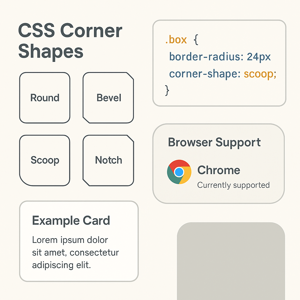
The CSS corner-shape property allows developers to define the geometry of a box's corners, moving beyond the simple rounding offered by border-radius. While border-radius controls the extent of the curve, corner-shape specifies the visual style—such as rounded, beveled, scooped, notched, squircle, or superellipse. This native CSS property simplifies the creation of complex corner designs that previously required workarounds like SVGs or clip-path.
Why was corner-shape introduced?
Designers have long faked special corners with SVGs, pseudo-elements, or clipPath. Those tricks work but add markup, increase complexity, and can be brittle. corner-shape brings these shapes into the native box model, making them responsive and easier to animate.
How does corner-shape interact with border-radius?
corner-shape needs a non-zero border-radius to have a visible effect. Think of border-radius as the “container” for the corner and corner-shape as the “style” applied to it. If border-radius is 0, a bevel or scoop won’t show.
What is the basic syntax for corner-shape?
.card {
  border-radius: 24px;
  corner-shape: scoop; /* try: round | bevel | scoop | notch | squircle | superellipse(3) */
}
How do shorthand and longhand properties differ for corner-shape?
Beyond the shorthand, there are logical longhands to shape corners along each edge, such as corner-block-start-shape and corner-inline-end-shape.
What is the default behavior and inheritance of corner-shape?
If you omit corner-shape, the default is round — which matches what you already know from border-radius.
What are the supported values for corner-shape?
round (classic rounded corners)
.rounded {
  border-radius: 16px;
  corner-shape: round;
}
bevel (angled cut)
.bevel {
  border-radius: 20px;
  corner-shape: bevel;
}
scoop (concave cut)
.scoop {
  border-radius: 28px;
  corner-shape: scoop;
}
notch (rectangular bite)
.notch {
  border-radius: 18px;
  corner-shape: notch;
}
squircle & superellipse(K) (smooth “super-rounded” corners)
.squircle {
  border-radius: 32px;
  corner-shape: squircle;
}
.superellipse {
  border-radius: 32px;
  corner-shape: superellipse(3.5);
}
How can corner-shape be applied with per-corner precision?
.banner {
  border-radius: 24px;
  corner-block-start-shape: scoop;
}
.mixed {
  border-radius: 28px;
  corner-inline-start-shape: bevel;
  corner-inline-end-shape: notch;
}
What are practical use cases for corner-shape?
Cards, modals, and tooltips
- Cards:
squirclefor a premium, soft feel. - Modals:
bevelfor an elevated look. - Tooltips: Use
scoopfor caret-like corners.
Avatars, badges, and chips
- Avatars:
superellipse(3)creates balanced curvature. - Badges: Use
notchfor ticket-style designs.
Buttons and callouts
- Buttons: Slight
squircle= modern and friendly.
How can corner-shape be used with progressive enhancement?
.button {
  border-radius: 20px;
  corner-shape: round;
}

@supports (corner-shape: scoop) {
  .button--pro {
    corner-shape: squircle;
  }
}
Which browsers support corner-shape?
As of now, corner-shape is experimental and available in Chromium-based browsers like Chrome. Safari and Firefox support are in progress.
What are the accessibility and performance considerations for corner-shape?
- Does not affect hit areas.
- Works efficiently like
border-radius. - Avoid animating on too many elements simultaneously.
Can I see copy-paste code recipes for corner-shape?
Superellipse card
.super-card {
  border-radius: 28px;
  corner-shape: superellipse(3.25);
}
Beveled tooltip
.bevel-tip {
  border-radius: 16px;
  corner-shape: bevel;
}
Scooped avatar
.avatar-scoop {
  border-radius: 24px;
  corner-shape: scoop;
}
Frequently Asked Questions (FAQs)
Conclusion
“The new css corner-shape and how to use it” empowers designers to move beyond ordinary rounded corners and achieve sleek, futuristic UI edges natively in CSS. With Chrome’s support and progressive fallback strategies, now’s the time to start shaping the web your way!
External Reference:
📧 Want to Stay Updated?
Get the latest web development tips and insights delivered to your inbox.
🚀 What Services do you Offer?
About the Author
Brian Keary
Founder & Lead Developer
Brian is the founder of BKThemes with over 20 years of experience in web development. He specializes in WordPress, Shopify, and SEO optimization. A proud alumnus of the University of Wisconsin-Green Bay, Brian has been creating exceptional digital solutions since 2003.
Expertise
Writing since 2003

